Interview: Illustrator Ilan Sheady
- Interview
 Tom Atkinson
- 0
- 16 minutes read

Ilan Sheady is an illustrator and horror lover that has as much artistic talent as he has passion for the genre.
His creative prowess extends beyond the realm of traditional artistry; Sheady has designed posters for Grimmfest, crafted horror-themed greetings cards, and lent his artistic touch to movie posters and DVD covers. Yet, his ambitions don’t stop at creating visually arresting art; he has also spearheaded the Liverpool Horror Festival through his horror-focused design agency, Uncle Frank Productions.
Sheady’s journey into the world of illustration is as fascinating as his creations. Influenced by iconic figures like Frank Frazetta, John Bolton, Rumiko Takahashi, and comic books, he embarked on a path that would lead him to become a freelance illustrator and animator, delving into commercial, corporate, and entertainment-based projects.
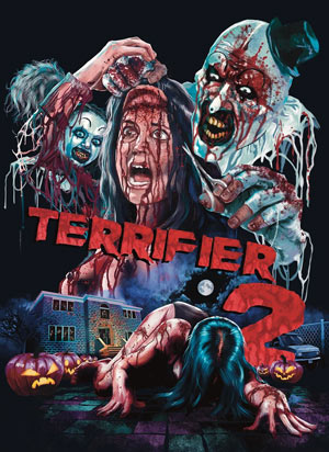
In the realm of horror illustration, Sheady’s work on the Terrifier movies stands out, and has generated palpable excitement within the horror community. His creative process involves immersing himself in the film, drawing inspiration from podcasts, reviews, and fan discussions. The result is visually striking covers that capture the essence of the films, as exemplified by his work on Terrifier 2 and the upcoming Terrifier 3, which have garnered attention and accolades.
We caught up with Ilan to talk to him about his career to date and delve into the influences and processes that result in his breathtaking work.
Can you tell us about your journey into the world of illustration?
There were two huge factors that got me into illustrating, the first was that I lived in a small Welsh town where my Dad worked in a paper factory. As a kid, there wasn’t a lot to do but We always had blank paper that we could draw on. When my Dad used to come home from work he’d just drop a stack of comics or magazines that he rescued from the recycling plant in front of my brother and me and we would scramble for the ones we wanted.
I’d always go for the horror magazines as I loved those beautifully illustrated film posters with shocking images that warned you about their contents. The other major factor was we had plenty of video shops around us. It felt like There was one on every street and even petrol stations or newsagents had at minimum a video rental section. I loved staring at the horror choices, imagining the stories. Then when I’d later get home I’d try to replicate the image with coloured pencils and crayons on the endless supply of paper my Dad provided.

It’s clear that you have a diverse range of artistic influences, who are the most important to you and how have these influences shaped your unique style as an illustrator?
Amongst the sea of video covers, magazines and comics it was clear to me which images I loved over others. Certain artists names kept cropping up, Frank Frazetta, Boris Vallejo, John Bolton, Graham Humphreys and Renato Casaro. Their mastery of paint was something I could never match with my chunky wax crayons.
Comics however it took a lot longer for me to get hooked in. The art style of western comics (particularly the ones I was getting free from my Dad) didn’t resonate with me yet. It wasn’t until I discovered Japanese manga that I found an aesthetic that excited me. Instead of the almost monotonous repetition of superhero comics of the 90s I loved the extremities of Manga and how the medium could create scenes of fantastical comedy and beautiful, colourful characters like the work of Rumiko Takahashi but also unimaginable terror like Junji Ito.
I feel the best horror imagery has a good blend of emotions. The more aesthetically appealing an image looks the more disturbing the elements of horror are. The prettier the smile the more unsettling the blood streaming down the face becomes.
Your work on the Terrifier movies is generating a lot of excitement in the horror community. Could you share some insights into your creative process when working on projects like these?
It was extra exciting for me as I already had a close relationship with Terrifier. The Liverpool Horror Club, which I cofounded with Chris Zombieking, Lady Mariam and Stu Jopia was one of the few screenings in the UK on its initial release. Then when the predictions around Terrifier 2 were still being whispered in horror circles I was contacted by the German distributor asking if I was interested in creating three distinct covers for the movie which came with a screener. I immediately knew this job was going to be a big one for me professionally.
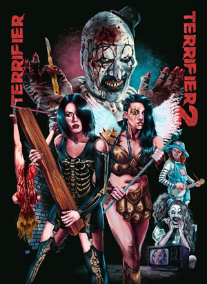
My process when it comes to doing any film covers or posters is typically to just keep watching the film until an image comes to mind. I also binge on podcasts, YouTubers reviews and read what fans say about it so that I know what is expected. I Treat every film like it’s someone’s favorite movie. Some films are easier to be inspired by than others like with the visual buffet Terrifier 2. Damien used pink and blue lighting to enhance some of the shots so I adopted that into my color palmette and as three covers were requested I figured each of the three core girls should get a violent and bloody cover to themselves with a unique location, especially for those who aren’t aware who the final girl is yet.
After the covers were almost immediately snapped up by collectors I was asked to do another version but go as brutal as I could…that one immediately connected with audiences with both the blood, violence and inclusion of Art’s yellow sunflower glasses.
It was after that cover became popular in the states that Damien approached me to do the poster for Terrifier 3.

You were also responsible for the famous Terrifier 2 vomit bags, how did that come about?
As with the Terrifier screening I was also involved in one of the only two screenings in the UK. I create artwork for The Dead of Night Film Festival and as we were the only place you could see Terrifier 2 outside of London, so we treated it like it was a big deal. I am a huge fan of William Castle’s gimmicks and marketing and since I had seen Terrifier 2 long before anyone else had I wanted to offer attendees a vomit bag with art the clown featured on it.
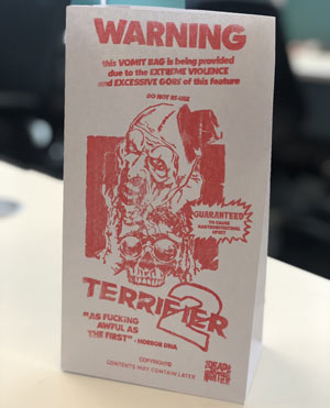
Someone in Brazil noticed and commented on Twitter that screenings were giving out sick bags which went crazy viral and even ended up being mentioned on Howard Stern.
Despite only 100 bags being created for the Liverpool screening, everyone was trying to hunt them down and I saw copies selling on eBay for £100s. It didn’t take long before I was commissioned to design the official vomit bags for the states and Canada.
How do you adapt your style and approach to meet the specific needs of different clients and projects?
Just like film directors can create distinct atmosphere in movies using visual techniques I feel like it’s my job to extend that into the poster or cover. For example when creating the cover to Arrow Video’s Blood and Black Lace I felt It needed to feel more dramatic and more ‘extra’ than typical Giallo covers. The ‘who dunnit’ ensemble cast and the beautiful, extreme lighting was something that hadn’t been focused on before in its long history of classic posters. There is, on the other hand, a very different requirement when creating artwork for Raven Banner’s release of Baskin which had a much more illustrative feel to help visualise the vast number of horrors and I kept to blue and red colours to match the lights of a police car.
You’ve also served as the art director for the Liverpool Horror Festival. Could you tell us more about your role and how your illustrative images contributed to the festival’s recognition on a global scale, including the praise you received from Clive Barker?
One of my first goals, when I started working for myself as a freelance illustrator, was to try to build a community of horror fans in Liverpool (where I lived at the time). To do that I thought to start by creating a horror event with film screenings, seances, special effects demonstrations and costume competitions. I had quite a lot of support and encouragement from some great people allowing me to do some pretty ambitious things. As I wanted to introduce and present myself as an artist I set myself the task of illustrating each of the events we planned with a different, unique style. One of the big events was a double screening of Hellraiser and Hellbound: Hellraiser 2. I chose an eerily minimalist approach inspired by the style of Saul Bass. After finishing the poster I shared it on Facebook and called it a night. The next morning I woke to thousands of comments and shares after Clive Barker himself shared the poster describing it as one of the best interpretations of his Cenobites. This was huge for me. Clive Barker is my hero and one of the reasons I pursued a less typical career path.
The festival helped me discover some great directors and artists who shared my ambitions and my bespoke artwork continued to help present our events to a dedicated audience but It is a personal career highlight for me that the first poster is displayed on the wall of Clive Barker’s home.
Horror is a genre that often explores deep and unsettling themes. How do you balance creating covers that evoke fear and unease while maintaining the artistic and emotional depth of your work?
There is often a delicate dance between what I want to show and what should be hidden. When it comes to film covers I don’t personally like illustrating the ‘money shots’ as that should be a privilege only the film should reap. I try to imagine what it would have been like for me seeing Darth Maul revealing he had a double bladed lightsaber in the movie instead of having it shown in every Phantom Menace trailer, publicity photo or merchandise before hand. Instead I like to help in a lot of the films anticipation. For my Nameless Media cover of Zombie Flesh Eaters I teased the infamous ‘eye/splinter’ scene instead of going full gore, while my best selling Terrifier 2 cover shows a very brutal scalping and arm breaking image but if you’ve seen the movie you know that it doesn’t come close to what the final scene does.
Your artwork has been used by boutique labels in the UK, Canada, America and Germany. What trends do you see when working with international clients?
I’ve always been a huge fun of Arrow Films from back when they did the white box packaging and used Rick Melton’s cover art. To this day I still feel they are one of the best distribution labels in the world. They set the bar for other boutique labels to aim for and I’m proud to be amongst their roster, which includes highly established artists, both in the US and UK.
Germany on the other hand is an incredible wonderland when it comes to their mediabook collectors market. For those who aren’t aware mediabooks are a hybrid of Blu-ray packaging and hardback books and the collectors market is the most intensely competitive I’ve ever witnessed. Each film is released with multiple cover choices making them all limited, but the choice of covers is like the renaissance of the grindhouse/exploitation golden years of film posters. Requests for more gore, more controversy and more nudity are very common. The reason the labels are able to do this is because most of the time these titles sell out before they even hit the store shelves or the public eye and the more extreme the cover the faster they are snatched up.
I was personally commissioned to do 8 different covers for the Terrifier franchise and the biggest selling versions were unsurprisingly the most brutal.


Could you share some advice for aspiring illustrators and artists who are looking to break into the horror genre or develop their own signature style?
I took a very unorthodox path when it came to my career so my advice might not fit every artist. But if I spoke to a much younger, more intimidated version of myself I’d tell them to not be afraid to put themself out there, to find their audience, find projects that matched their passion wherever they can and if there isn’t, to make their own. Above all I’d tell myself to stop waiting for perfection when it comes to sending your portfolio to the people you want to work with.
As an artist you are constantly growing, 3 years after drawing the best picture of your life you will look back at it and see things you personally hate or want to change. Send that email and you may find that the standard you set yourself may be much higher than you need it to be to get started.
What projects or collaborations are you particularly excited about in the near future, and how can your fans and admirers stay updated on your latest work and developments?
The unfortunate side of my job is I can’t show anything off or even talk about it before the distributors have already announced it. This is because sometimes film licenses jump around between different distributors and you can’t interfere with one distributors sales by showing that a new one will be released in a couple of months.
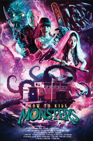
I will say that I’m waiting on some VERY interesting titles being revealed by Nameless Media, Raven Banner Entertainment, 88 films and Film Treasures. This year I also started working as a creature designer and art director on a very exciting video game by Spoondrift Games and finally keep your eyes on Dark Rift who created the festival favorite horror film How to Kill Monsters as there should be some interesting projects from them in the future 😉
You can follow Ilan on Instagram at @unclefrankpro where he will be sharing details on his projects as soon as he’s permitted to.